
When people use a travel platform, they don’t just click around randomly. They follow a path to reach a goal. In design, this path is called a User Flow.
A user flow is a simple diagram that shows the steps a person takes inside a product. It’s not about the design details or visuals. It’s about the journey from point A to point B.
Why User Flows Matter
Travel platforms are full of complex choices—destinations, dates, room types, payment options. A user flow helps teams see how someone moves through these steps.
- It shows where a traveler might get stuck.
- It highlights moments where the process can be faster.
- It keeps the design team focused on the actual user journey, not just the interface.
Without a clear flow, it’s easy to build features that look good on their own but feel confusing when connected.
A Travel Example: Booking a Hotel
Let’s look at a common scenario: booking a hotel online.
The goal is clear: reserve a room. Here’s what the flow often looks like:
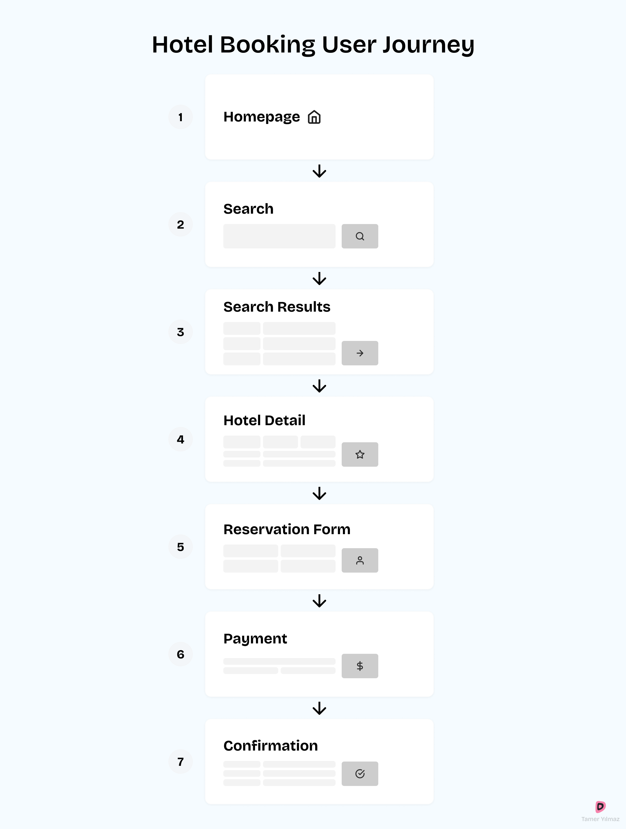
- Homepage → the user starts here.
- Search box → they enter destination and travel dates.
- Results page → a list of available hotels appears.
- Hotel detail → they select a hotel and view details.
- Reservation form → they fill in personal and booking information.
- Payment → they add card details or choose another payment method.
- Confirmation → the booking is complete.
On paper, it seems simple. In reality, each of these steps can make or break the booking. A slow-loading results page or a confusing payment form can cause a drop-off.
Designing Better Flows
Good travel products don’t just map the flow once. They test, refine, and simplify. A few practical tips:
- Keep the main path short. Every extra step is a risk of losing the user.
- Offer smart defaults. If someone always books for two adults, pre-fill that choice.
- Reduce decision overload. Don’t show 30 filters before the first hotel result.
- Make errors easy to fix. If the payment fails, don’t make the user restart the whole process.
By improving the flow, you’re not just making the product look better—you’re making it easier for people to achieve their travel goals.
Final Thoughts
User flows are not just a design exercise. They’re a tool for empathy. They help us see the product the way travelers see it.
In the travel-tech world, where small frustrations can lead to abandoned bookings, clear user flows are one of the best investments a team can make.